Math in Art
Discover the many ways artists use math in creating their masterpieces.
****
Fact #1: Medium + Artist = Art
Whether they know it or not, artists use math in every work of art they create. To make drawings, sculptures, paintings, and textiles, they must add or subtract art materials. Applying paint to a canvas is an example of the additive process. So is weaving fibers together into a textile. An example of the subtractive process is carving wood or stone, as in the Chinese Jade Mountain sculpture, shown here, which was made in 1784 for the Qianlong emperor.
The Chinese imported jade from the lands that are now Afghanistan, Tibet, Burma, and Siberia, where rocks containing jade were found in streams and mountains. Extracting the precious mineral without the use of modern machinery was very difficult, and it then had to be transported over long distances.
Jade is so tough and hard that it must be carved by grinding it with an even harder substance, such as quartz dust. By grinding and polishing, the maker of the Jade Mountain subtracted areas from this large stone to create intricate details like the figures of the poets, the wine cups floating downstream, and poetry by the famous calligrapher Wang Xizhi and the Qianlong emperor himself.
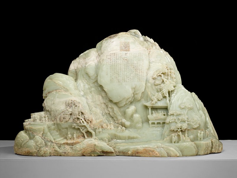
Fact #1 caption/s
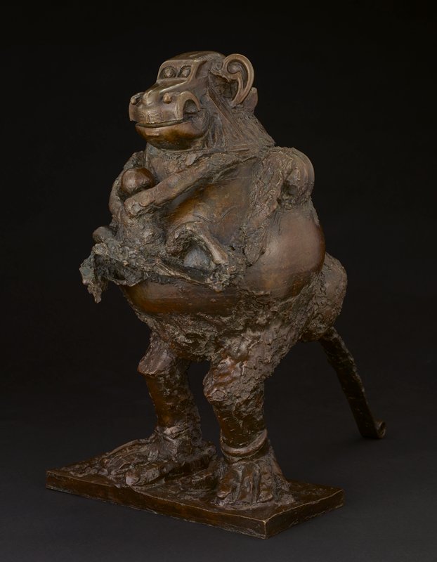
Picasso was one of the first artists to create sculpture by adding objects together in a process called assemblage. Try to identify the "found" objects he assembled in this monkey.
Many separate pieces of blown glass were added together to form this sculpture by Dale Chihuly.
Both additive and subtractive processes were used in making this figure from the Kongo culture in Africa. Each added nail stands for a binding promise. Kongo people, Democratic Republic of Congo.

****
Fact #2: Shape Up!
Artists sometimes simplify forms that they see in nature, or in their imagination, into geometric shapes. These abstract shapes may then serve as symbols for the objects or geographical features that inspired them.
The Lakota of the Northern Plains often put abstracted geometric designs of animals, tipis, and their surroundings into the beadwork decoration on their clothing. This dress, which was worn during ceremonies, is embellished with various geometric shapes: triangles, squares, diamonds, circles. In Lakota culture, it was customary for women artists to use geometric symbols, whereas men worked in a more pictorial style.
Each shape and color on this dress symbolizes part of the Lakota creation story. The green U that falls over the wearer's heart represents a turtle. A sacred animal to the Lakota, the turtle was the only creature able to bring mud up from the the waters (bring mud up from the waters) so the Creator could mold the Earth and humans. Because of the turtle's connection to creation and fertility, green U shapes and ovals are often seen on the yokes of women's clothing. On this dress, the broad areas of blue stretching across the top are thought to signify the sky and a lake, separated by a tan line marking the shore. The large designs made up of diamonds and triangles could stand for stars, spiritual beings, clouds, or tipis, which are reflected in the lake. The cross-shaped designs in the lower blue band may represent the four directions. Every design, no matter how simple, symbolizes something spiritually important in the creation story.

Fact #2 caption/s
Modigliani's sculptures and paintings of women rarely resemble the person he was portraying. He simplified this woman's appearance, carving only her oval eyes, triangular nose, and circular mouth.

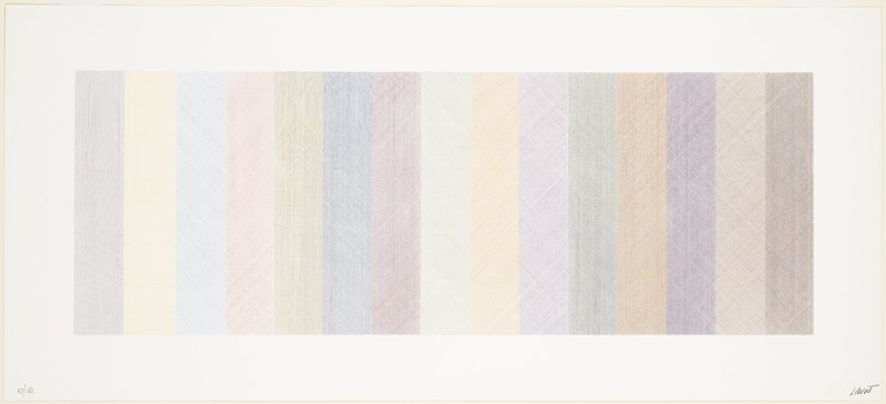
Sol LeWitt conceived works of art that were fundamentally geometric and architectonic, and relied on the cube as a starting point for his explorations of space, time, form, volume, repetition, sequence, and variation.
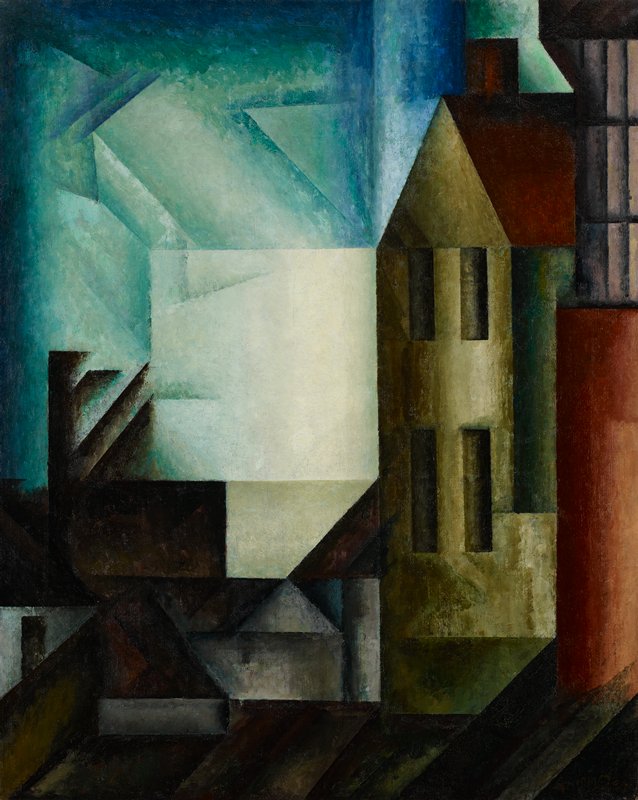
One of the best-known types of abstract art is Cubism. Speaking of his own work, the cubist painter Lyonel Feininger said, "What one sees must be transformed in the mind and crystallized." Feininger reduced this painting's subject to geometric shapes, but you can still tell what it is.
****
Fact #3: A Unique Perspective
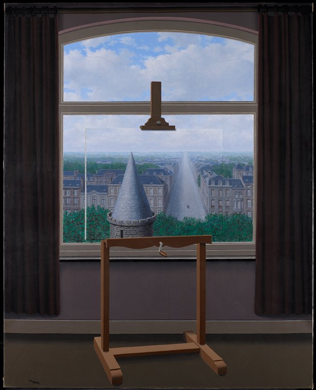
René Magritte's Promenades of Euclid, painted in 1955, is a wonderful example of one-point linear perspective. Invented during the Renaissance, over five hundred years ago, linear perspective is a simple method of using lines to give an illusion of depth.
Renaissance artists strove to make their paintings look as real as possible. This prompted them to use geometry to help fool the eye into seeing depth beyond the painting's flat surface. By having lines come together at a "vanishing point," they developed linear perspective as a way to make painted landscapes and architecture appear solid and three-dimensional.
An artist using linear perspective begins by establishing a horizon line. This is the meeting place of earth and sky, where the sun rises and sets and the landscape recedes beyond what the eye can see. Lines in the artwork converge at a single point on the horizon, the way railroad tracks appear to meet in the distance. Objects closer to the viewer are shown as larger than those farther away, just as they look in nature.
In his Promenades of Euclid, a clever painting within a painting, Magritte used linear perspective for the promenade (walkway) and the cone-shaped tower that mimics it. He created a trompe l'oeil (French for "fool the eye") that makes us wonder whether the scene outside the window is the same as that painted on the canvas which is blocking the view.
Fact #3 caption/s
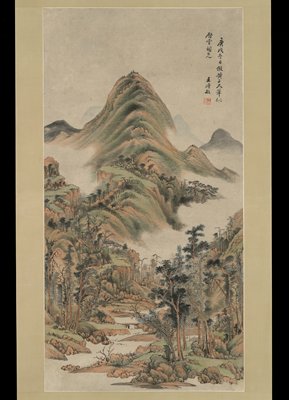
Another way to show distance is aerial perspective. By painting the mountains farthest away in less detail and partly hidden by clouds, this Chinese artist created the illusion of distance. Magritte also used aerial perspective, painting the background in bluish shades and with less precision.
Before the Renaissance, in medieval times, artists had different aims. The designers of medieval textiles like this one did not use mathematical perspective but instead crowded the figures into a space that seems too small to hold them all.

Magritte also used geometry to create a convincingly solid cylindrical tower with a cone-shaped top.
****
Fact #4: Splendid Symmetry
From the earliest times, artists have made use of symmetry and pattern in creating and decorating works of art and architecture. Symmetry involves specific ways of repeating a shape. There are several types of symmetry: reflection, rotation, and translation. In reflection symmetry, a shape is "flipped" across an imaginary line to produce its mirror image. In rotation symmetry, a shape is turned at a constant angle and repeated. In translation symmetry, a shape is repeated by sliding it (forward, backward, sideways), without flipping or turning. In all of these transformations, the shape's line lengths and angles stay the same.
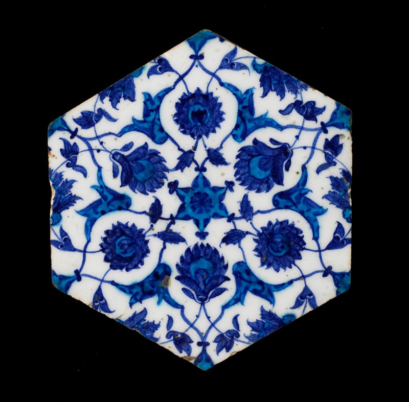
What kind of symmetry does this tile have? To answer, you need to know why the tile was made and where it belonged. Hexagonal (six-sided) tiles were used in Islamic countries to decorate mosques and palaces, both inside and out. In Islamic religious art, abstracted vines, leaves, and flowers became common motifs. Many artists depicted flowers and plants native to their own region. Often whole walls were covered with identical tiles that formed a continuous pattern. Repeating a single tile design over and over in all directions is an example of translation symmetry. (This particular tile also has reflection symmetry, since you can divide it into mirror-image halves.)
In designing decoration of all kinds, Islamic artists used symmetry for cultural reasons. The repetition of identical motifs symbolized unity in multiplicity, an important idea in Islam. The colors and plants chosen for this tile reflect the surroundings, interests, and artistic taste of the people living when and where the tile was made.
Fact #4 caption/s
This quilt, made by Amish women in Pennsylvania, is an example of reflection symmetry.

In this example of rotation symmetry, the design in one-fourth of the light fixture is repeated three times, turning at 90-degree angles around the center. William Gray Purcell, George Grant Elmslie, Mosaic Art Shops (E. L. Sharretts), Ceiling light fixture, 1913, glass, zinc caming, Minneapolis Institute of Art, bequest of Anson Cutts, Jr.
The animal decoration of this Guatemalan weaving has translation symmetry. The design repeats as though sliding up and down and sideways, but it is not flipped or turned.

Maya culture, Guatemala, Tzute, 1935-40, cotton, Minneapolis Institute of Art, gift of Richard L. Simmons
****
Fact #5: Perfect Proportion
This marble figure is a copy of a bronze sculpture made by the Greek artist Polykleitos about 440 B.C. To create this statue of an ideal human form, Polykleitos developed a mathematical system of proportions that brought sculpture to a new level. He called his system the Canon (meaning"rule").
For Greek artists, the harmony, order, and balance they saw in nature was the standard of perfection they aimed for in art. In his Canon, Polykleitos set forth the mathematical relationships between different body parts that would result in a perfect human form. Historians think he based his system on the concept of symmetria, or harmony between the parts and the whole. They believe he may have used the proportions of a finger to determine the proportions of all the body’s parts to each other and to the body as a whole.
Polykleitos sculpted his ideally proportioned Doryphoros (Spear Bearer) in a pose that looks natural but is not (try it out yourself). The figure stands in what is called the chiastic (ki-AZ-tic) pose. His tensed right leg bears his weight, while the left leg is relaxed. His left arm (now broken) is bent to hold a spear, while the right is relaxed. This balance of tension and relaxation on opposite sides makes the body look natural and gives a sense of movement though the figure is at rest.
The original bronze Doryphoros no longer exists. The version in Mia's collection was made by a talented Roman sculptor who copied the masterpiece, taking careful measurements to reproduce its proportions

Fact #5 caption/s
Architects in ancient Greece used their knowledge of mathematical proportion to create balance and symmetry in this famous building, called the Parthenon. Photo: Simon music, Creative Commons License
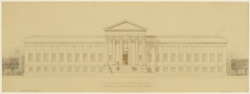
This entrance to Mia resembles the Parthenon but has different proportions.
The 20th-century cubist painter Juan Gris used geometric proportions and mathematical relationships to create visual harmonies strikingly different from the statues of Polykleitos.

****
Related Activities
****
Writing on the Wall
Using a protractor and ruler, make a drawing based on lines, arcs, circles, and grids. Then write a set of instructions to trade with a friend or classmate. Tape a piece of paper to the wall and use the instructions to re-create the drawing. Then use your protractors to check each other's drawings for accuracy.
Design Your Own Beadwork
Use graph paper and colored pencils to create a geometric design for beadwork. Imagine that each square is one bead, and make your design tell the story of a significant event in your life. What do the shapes, lines, and colors of your "beadwork" represent?
Going Crazy
Use either a computer program or a square piece of paper to create a tessellation. Then all students can pool their squares to make a class quilt! You may want to agree on certain qualities to keep constant such as colors or size. An explanation of the procedure can be found at Tessellations.org.
Paper Perfection
A proportion known as the golden ratio (or golden mean, or golden section) was popular with Renaissance artists. Create a golden ratio rectangle by folding a piece of paper according to these directions from Mr. Narain’s Golden Ratio Page.
Golden Opportunity
Explore the golden mean through the activities suggested in Princeton Online’s Incredible Art Department Web site.
Symbols, Symmetry, and Stories
Learn more about the story behind the symbols in the Lakota dress with World Myths and Legends in Art online resource. Then, discover additional artful symmetry and learn about the Islamic faith by visiting the Minneapolis Institute of Art World Religions in Art resource.
Math in Art Reading List
Everyday Mathematics: Student Reference Book. The University of Chicago School Mathematics Project. Columbus, Ohio, and Chicago: SRA/McGraw-Hill, 2002.
Jacobs, Harold R. Geometry: Seeing, Doing, Understanding. New York: W. H. Freeman and Company, 2003.
Kalajdzievski, Sasho. Math and Art: An Introduction to Visual Mathematics. CRC Press, 2008.
Stephens, Pamela, and Nancy Walkup. Bridging the Curriculum through Art: Interdisciplinary Connections. Glenview, Il.: Crystal Productions, 2000.
Tobin, Richard. "The Canon of Polykleitos." American Journal of Archaeology 79, no. 4 (1975): 307-21.