Color My World
Compare how five artists from around the world used color to communicate.
Fact #1: The color of feelings
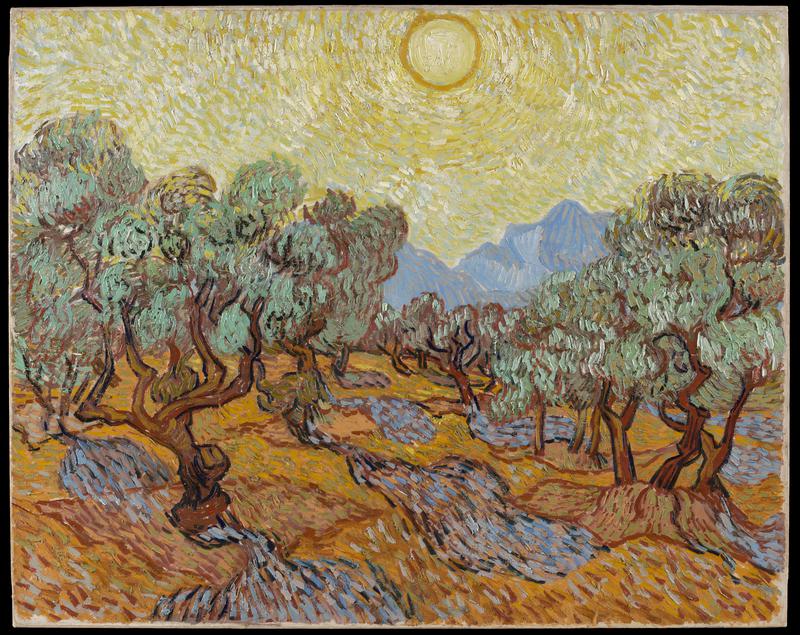
The color is exquisite here. . . . When it gets scorched and dusty, it does not lose its beauty, for then the landscape gets tones of gold of various tints, green-gold, yellow-gold, pink-gold . . .
Vincent van Gogh wrote these words to his sister Wil soon after moving to the south of France. He contrasted his colorful surroundings with the northern landscape of their native Holland. The sun in these parts, that is something different.
Earlier, van Gogh had lived in Paris, where he and other painters had argued hotly about how to make colors appear most vivid. Van Gogh longed for a landscape to match the intensity of his ideas. The south of France promised just such a colorful world. During two years there, he made hundreds of paintings.
In Olive Trees, sunlight pulses across the sky not the blue sky you might expect, but a yellow sky that seems to radiate heat. Under the trees, the dark shadows are shockingly blue, offering cool relief from the orange of the sunburned ground. The olive trees struggle toward the sky yet stay firmly rooted in the earth.
Van Gogh makes us sense the French landscape physically, but his pictures go deeper. He was a very religious man. For him, every landscape had a spiritual quality, which shows in the picture's quivering energy. This unsettling energy may also reveal some of van Gogh's inner feelings. He was long troubled by spells of mental illness and was a patient in an asylum when he painted this picture. Within a year he had ended his life.
****
Fact #2: Coloring the real world
Imagine yourself in a church five hundred years ago in the city of Bruges (now in Belgium). Candles flicker in the darkness. You blink and rub your eyes. The painted scene on the altarpiece before you looks so real.
You can almost feel the thick golden brocade of the robes. The fabrics look like those produced in nearby workshops. You recognize the towers of Bruges on the horizon. Familiar hills fade into the distance. And there in the center, Mary sadly holds her dead son, Jesus. They seem as real as the world you see around you every day.
The name of the artist who painted this altarpiece is unknown today. Whoever he was, he had mastered a new way of painting. About one hundred years earlier, painters in northern Europe had begun mixing their colors with oil. Oil made the paint dry more slowly, so artists could layer and blend colors to create more lifelike images.
Pictures made with oil paints added drama to the teachings of Christianity. For most of the year, the scene on this altarpiece was hidden from view. The two side panels folded in on hinges, covering it. On the closed panels, gray figures painted to look like sculptures gave no hint of the wonders within. When the panels were opened on holy days to reveal the colorful painting inside, it must have seemed like a miracle.

Fact #3: Beyond light and dark
Color fades from the world when the sun goes down. In the moonlight, away from city lights, everything seems to be a shade of gray. Several nights each month are almost black, before the sliver of the new moon appears.
For the Tabwa of Congo and Zambia, in Africa, the dark time between moons is fearsome. Lions, snakes, and other creatures are more dangerous when you cannot see them. Without the light of the moon, the Tabwa feel, sinister forces are free to roam. The rising of the new moon, called balamwezi in Tabwa, brings more than light. Balamwezi stands for courage, hope, and understanding.
The pattern of triangles on the forehead of this mask also is called balamwezi. Such interlocking triangles appear throughout Tabwa life woven into baskets, carved on tools, braided into hair, or etched in the skin. The alternating dark and light triangles on the mask recall the phases of the moon. Wherever the balamwezi pattern appears, it reminds Tabwa people of the new moon's message of hope.
Someone with power to see the invisible would have worn this mask. The feathers crowning the mask symbolize such power. They are from the jungle fowl, a bird known for its uncanny ability to crow just before dawn. The colorful beads on this mask are rare in Tabwa art. But perhaps the brightly colored face suggests another power the clear, colorful vision of the full light of day.

Fact #4: Rules and rulers
Bright yellow for the emperor and empress. Apricot yellow for the heir to the throne and his wife. Golden yellow for the emperor's mistresses and his sons. Blue or brown for lesser princes and their wives. Blue or black for other officials and their wives.
The rules about who could wear what in 18th-century China filled twenty volumes. Only the emperor and those closest to him could wear yellow, which symbolized the center of the universe. Everyone who was anyone at the imperial court owned a dragon robe to wear on official occasions. But rules controlled how many dragons could appear on a robe. The emperor's robe had nine. And only the emperor and his closest family could sport dragons with five claws instead of the usual four. By these rules, this robe likely belonged to a woman close to the emperor.
Certain features appeared on all dragon robes. Diagonal lines around the bottom stand for the oceans of the world. Frothy waves form spirals where the water meets land. Rocky mountains rise at the front, back, and sides, symbolizing the four directions. The dragons frolic across a heaven filled with little clouds. Dragon robes formed a sort of map of the universe, and the people who wore them knew their place in that world.

Fact #5: Collecting color
A work of art 36 feet tall cannot be seen all at once. Your eye must take you on a journey, from the floor to the ceiling three stories up.
You might start at the bright red tentlike shape near the floor. Hop from there through cool splashes of blue to a patch of yellow. Tiptoe across a slick of brown to a shower of white. Then climb beneath cool greens to a high place for a rest, and gaze up at the expanse of blue beyond. You're almost there.
California artist Tony Berlant was asked to create a work of art especially for the lobby of The Minneapolis Institute of Art. He collected ideas for Mountain Journey from many sources, including the Institute's galleries. Mountain Journey is tall and narrow, like the museum's Chinese scroll paintings. Berlant remembered his own travels to China's sacred mountains, often pictured in scroll paintings. And he recalled the view from the plane as he arrived in Minnesota. The cool blue splashes may remind you of the state's many lakes seen from above.
Berlant gathered the colorful materials of Mountain Journey from some surprising places. His studio is filled with tons of metal scrap, old signs, sides of trucks, tin trays, painted sheet metal, sorted by color into bins. He cut shapes from these scraps and nailed them onto plywood panels, combining the patches of color into a completely new vision. Here and there, however, you can glimpse a hint of their origins.

Related Activities
Colorful Meanings
In the United States, if you see the color red on a road sign, how should you react? It probably would be a good idea to stop. Colors can have particular meanings in different places and situations. Pick a color and make a list of different things (road signs, patriotic symbols, holidays, etc.) that you connect with that color. Create a collage to reflect those connections.
Color Theory
Both artists and scientists have wondered how colors interact with each other. Research color theories that explain how colors behave. Then make a color wheel to illustrate your findings.
Colorful Moods
What does it mean to feel blue? Often, we can use colors to describe emotions we are feeling. Discuss what colors make you happy. Sad? What is an angry color? Think about how you are feeling today. Then create a self-portrait using the colors that best match your mood.
Colorful Descriptions
Vincent van Gogh wrote many letters to family and friends describing the vivid colors of the landscape in the south of France. Look at a picture of an inspiring landscape and write a letter to a friend describing it in terms of the colors you see.
Comparing Colors
Create a work of art using oil paints or oil sticks. Then create the same picture with tempera paint or watercolors. Compare the two paintings. How are the colors different? Which paint works best for blending colors? Think about why artists would choose one type or the other. What are the pros and cons of each type of paint? Which one would you prefer to work with?
Light and Color
How do colors change with the light? Compare the same scene at different times of day and in different weather. How does the amount of light change the colors you see? How do those colors affect the mood of the scene? Record each observation in a log and compare your findings.
Color Your World
Tony Berlant used materials found in his environment to create the colorful Mountain Journey. Look at the environment that surrounds you. What colors do you notice? Gather colorful materials (both natural and human-made) to create a work of art inspired by your own environment.
A Trip to the Art Museum
Visit The Minneapolis Institute of Art and see the real works of art. Request the tour “Why is the Sky Yellow?: Artists’ Choices” to pursue some of the ideas explored in these activities. Teachers, use the online tour request form to arrange for a guided or self-guided tour.